Well, it has been over a year since I last posted here. In that time I've had two trips overseas that I have posted on my travel blog.
I thought it was a good idea to keep my personal and travel blogs separate but now I'm not so sure. What do you think?
Between Facebook and Instagram and blogs and Flickr etc have so many options for keeping in contact with friends it is hard to know which platform to use.
After we returned from Malaysia last year I worked like a crazy thing to create my photo album. I took so many photos that I ended up with not one but two very thick photo books - 350 pages in total!! I printed these with Albumworks, an Australian company.
I went with the full page photo / photo grid spread that I've used the past few trips. It works so well for me. There is NO WAY I could have created 350 individual page designs!!
I've posted some of the pages in my DesignerDigitals gallery
And here is a preview of some of the two page spreads:
I used Cathy Zielske's Six by Eights Layered Template Set No. 01 and No. 2
I rotated them 90 degrees for my landscape book. These templates worked so well for my mix of landscape and portrait photos, it made it so easy to complete my pages quickly.
So now for my most recent trip... I returned from Sri Lanka last week. I did not take nearly as many photos on this trip because my camera failed. That is a whole other story. So since many of my pics were taken on my point-and-shoot camera I thought I'd use this template set. It's a set I've been wanting to use ever since Katie Pertiet first released it in 2009!
And this template set just happens to be on sale right now!
So I'll let you know how it goes. Promise :)
Friday, September 18, 2015
Monday, September 8, 2014
Scrappy blog tour
I was tagged by Lynn Grieveson to join in this blog tour!
I have been a bad blogger, so it is good to have a prod to post again!
Here are the blog tour questions
Here are a few:
I've added Designer Digital products to the page background and into photo spots.
I've also just finished reorganizing my computer space with a little help from Ikea. I picked up some photomats yesterday and popped some of my photos into the Billy bookcase doors above my desk. Here it is with the chair I recovered, a new Ikea desk-top and recycled cupboards transformed with new handles from Ikea. Love this space - cheap, cheerful and functional!
For my current project, I'm loving using the pencillines goodies from Designer Digitals to add a bit of informality to my pages.
Of course when I'm busy or under the weather, mojo disappears, and usually it's time to take it easy and wait for inspiration to appear out of the blue.
Joining the local camera club has helped me stay inspired with my photography. Each month there are activities, excursions and competitions which I participate in whenever I have the time.
OK... the whole idea of a blog tour is that you hand link up a few other bloggers who have participated. Many of my creative blogging friends have already posted their blog tour entry.
I have nominated Maureen Reynolds to carry the baton :)
And if you'd like to visit a few posts by my other friends: Carol, britgirl (Mel) .
I have been a bad blogger, so it is good to have a prod to post again!
Here are the blog tour questions
1. What am I working on right now?
Last November I was very lucky to travel to the USA and meet many of the amazing women who are part of the Designer Digitals Creative Team. I took an extended vacation, first with Carol and some of the other ladies from the team and then with the family. I took 7000 photos! So my project right now is to sort them out put them into a book or two or three! It will take too long to scrap them so I've decided to use Lightroom's Book Module to create the pages.Here are a few:
I've added Designer Digital products to the page background and into photo spots.
I've also just finished reorganizing my computer space with a little help from Ikea. I picked up some photomats yesterday and popped some of my photos into the Billy bookcase doors above my desk. Here it is with the chair I recovered, a new Ikea desk-top and recycled cupboards transformed with new handles from Ikea. Love this space - cheap, cheerful and functional!
2) How long does it take to create a project?
Hmm... define a "project"! I can spend a couple of hours on a single page! I generally try to finish a page in an hour. These Lightroom pages take maybe 10 minutes, but it might take me another hour to sort through my photos and edit them first!3) What are my favourite things to create with at the moment
Have I mentioned Lightroom yet?! I love the magic of editing a photo to discover things hidden in the shadows or add that crispness and pop with the sliders. I used to find it so hard to cull photos. It was hard to check which ones were the best and even harder to press the delete key on the rest. Lightroom lets me view photos side-by-side and zoom in to pick the best ones, and simply flag the others for deletion later. That suits a perfectionist-procrastinator like me down to the ground! ;)For my current project, I'm loving using the pencillines goodies from Designer Digitals to add a bit of informality to my pages.
4) How do I become inspired and stay inspired?
The web is a wonderful place! There is so much inspiration there. I love to browse the galleries and occasionally get lost in Pinterest. You can see how I used my Pinterest shelving board helped me design my working space! I spend a lot of time in planning!Of course when I'm busy or under the weather, mojo disappears, and usually it's time to take it easy and wait for inspiration to appear out of the blue.
Joining the local camera club has helped me stay inspired with my photography. Each month there are activities, excursions and competitions which I participate in whenever I have the time.
5) What is my signature style?
It is always hard to pick your signature style. I think it's easier for others to do that. I know I tend not to use a lot of layers on my pages, I prefer to focus on my story and the photos. I do create a lot of travel books and prefer double page spreads. I find having a full page photo on one side makes it so much easier. It provides instant contrast with the white space and photo-block on the facing page and is super quick to do! I like white backgrounds and subtle use of other elements such as paint spatters or the pencil lines I'm currently using. I love to use lifted white photo frames and brads or flair to add dimension.OK... the whole idea of a blog tour is that you hand link up a few other bloggers who have participated. Many of my creative blogging friends have already posted their blog tour entry.
I have nominated Maureen Reynolds to carry the baton :)
And if you'd like to visit a few posts by my other friends: Carol, britgirl (Mel) .
Friday, March 28, 2014
Lightroom Slideshow of Mexico
Creating a slideshow from Lightroom has been on my To Do list for quite a while, and I was inspired to give it a go yesterday. It is SO easy! I thought I'd share a slideshow of our trip to Mexico from last November.
Enjoy :)
Enjoy :)
Music: Quasi Motion (Kevin MacLeod) / CC BY 3.0
Want do learn how to do your own? Julianne Kost explains it quite nicely on the adobe blog and in on adobeTV.
Want do learn how to do your own? Julianne Kost explains it quite nicely on the adobe blog and in on adobeTV.
Saturday, March 8, 2014
Templates at Designer Digitals
I hosted my first challenge at the Designer Digitals store this week.
For the challenge I chose two templates that I rather love:
Tender Moments Layered Template
and Scrap Express No. 134
The Designer Digitals gallery is already buzzing with pages using the two templates.
This is my page for the challenge - my daughter’s 17th birthday (which was over a year ago!):

Now ALL templates are on sale at Designer Digitals.
Template Mashup Challenge: Scrapping Moments
For the challenge I chose two templates that I rather love:
Tender Moments Layered Template
and Scrap Express No. 134
The Designer Digitals gallery is already buzzing with pages using the two templates.
This is my page for the challenge - my daughter’s 17th birthday (which was over a year ago!):
Now ALL templates are on sale at Designer Digitals.
Just thought I'd let you know :)
Saturday, February 15, 2014
My Travel Album Cover
Hi,
It's been so long I couldn't even remember how to start a blog post!! Never mind, I'm here now :)
I posted a page at Designer Digitals yesterday (click the photo to view in the gallery there).
It's a page for a scraplift challenge - with wonderful inspiration:
My friend, Maureen, said she "totally didn't understand" how I did it - which I don't believe for a second, but I thought I'd post my process in case anyone is interested.
Paste it onto your new page.
BTW, this could be ANY image from which you want to select a shape to use as a mask.
Note: If your map was an overlay (like mine) you will need to turn on sample all layers so you can grab the white background for the countries.
It does get a bit fiddly. You will need to switch between the Add to selection and Subtract from selection buttons to refine your selection – remove country names, etc.
Now press Ctrl + D to clear your selection.
Hide your map overlay layer.
Then drag into place and press Ctrl + Alt + G to clip it to the Extracted Map mask layer. Suddenly it’s starting to look like something!
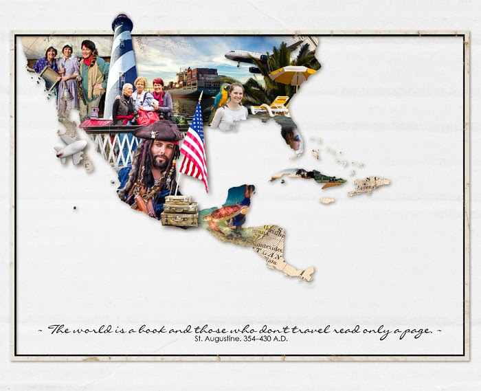
And maybe it does look complicated, but honestly I took longer selecting the photos than I did creating the page!
So if you do a page like this and you don't post it in the Designer Digitals gallery, please post a comment with a link to your page!
I posted a page at Designer Digitals yesterday (click the photo to view in the gallery there).
It's a page for a scraplift challenge - with wonderful inspiration:
My friend, Maureen, said she "totally didn't understand" how I did it - which I don't believe for a second, but I thought I'd post my process in case anyone is interested.
Step 1 Open a new canvas
Create a new 3600 x 3600 page (actually, mine is not square, but it doesn’t matter).Step 2 Add your map image
Open a map of the country you visited. I used Map overlays no1 by Katie Pertiet.Paste it onto your new page.
BTW, this could be ANY image from which you want to select a shape to use as a mask.
Step 3 Select the countries from your map
Use the Quick Selection Tool to select the countries you are after.Note: If your map was an overlay (like mine) you will need to turn on sample all layers so you can grab the white background for the countries.
It does get a bit fiddly. You will need to switch between the Add to selection and Subtract from selection buttons to refine your selection – remove country names, etc.
Step 4 Create an Extracted Mask Layer of your country
There are a couple of options you can use now. But one way is copy your selection using Edit -> Copy Merged (Shit + Ctrl + C) and paste as a new layer.Now press Ctrl + D to clear your selection.
Hide your map overlay layer.
Step 5 Clip a background image to your Extracted Mask Layer
You can choose any background you like. It just serves to fill in any gaps that the photos don't cover. I placed a Roughed Up Photo Mats Map over my mask layer.Then drag into place and press Ctrl + Alt + G to clip it to the Extracted Map mask layer. Suddenly it’s starting to look like something!
Step 6
I added a shadow to my Extracted Map mask and dragged the two layers to make the map larger on my page.Step 7 Add background photos
Then, starting at the top I added my background photos, clipping them to the Extracted Map mask in the same way I clipped the map in the step above.. I erased some of the edges of the photos to blend them into the map. (I actually used a layer mask to hide the edges rather than using the actual eraser.)Step 9 Adding foreground photos
On top of those background images I placed a few extracted images. I did the extraction using the same way as I extracted the map mask. Mostly I just deleted the sky which is an easy one to select with the Quick Selection Tool and then press delete. Then I moved each one onto my page and placed it in position. Here they are all removed from the mask so you can see what I used. I have added a little shadow to each one already.Step 10 Finishing Touches
Then I added the frame and text. (Actually I did them first because it gave me a sense of the overall design early on, but I forgot to show you that here!). And here it is again, the finished album cover!
And maybe it does look complicated, but honestly I took longer selecting the photos than I did creating the page!
Credits
- Fifty States Brushes and Stamps MegaPak Map Overlays No. 01
- Rimmed Framers No. 02
- Roughed Up Photo Mats: Maps No. 02
- Almost There Solids Paper Pack
- Curated Studio Mix Scrapbooking Kit No. 01 (plane and suit cases)
- Finley Element Pack (also has the suitcases)
- Going Away Element Pack (also has the plane) Drop Shadow Styles Collection
So if you do a page like this and you don't post it in the Designer Digitals gallery, please post a comment with a link to your page!
Monday, November 4, 2013
A big adventure
I am currently in the USA with my friend Carol. Having the BEST fun!!
I'm posting photos on a travel blog I've created. It is here.
I'm posting photos on a travel blog I've created. It is here.
Wednesday, September 18, 2013
Club Activity: Night photography around Lake Weeroona
I am a member of the local camera club. It is such great fun to share your passion with like-minded people and a great excuse to behave totally weird in public :)
I posted these photos directly from Lightroom using a plug-in (LR/Blog). It took me heaps of experimentation to figure out how to set it up so that when you click on a photo it opens a larger version!
I posted these photos directly from Lightroom using a plug-in (LR/Blog). It took me heaps of experimentation to figure out how to set it up so that when you click on a photo it opens a larger version!
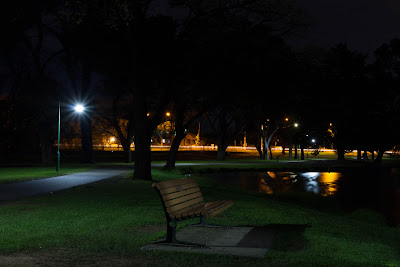 | A restful seatWith a little light painting by Boyd to brighten it. |
 |
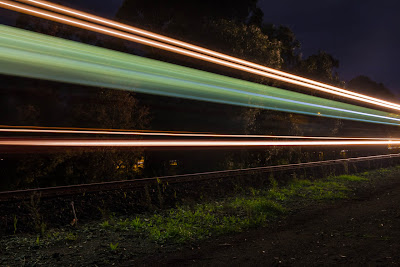 | Passing trainThis is the one that interrupts our meeting every Tuesday evening about 8:30! |
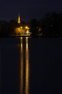 | Lake WeeroonaThe Cathedral in the distance |
Subscribe to:
Comments (Atom)


